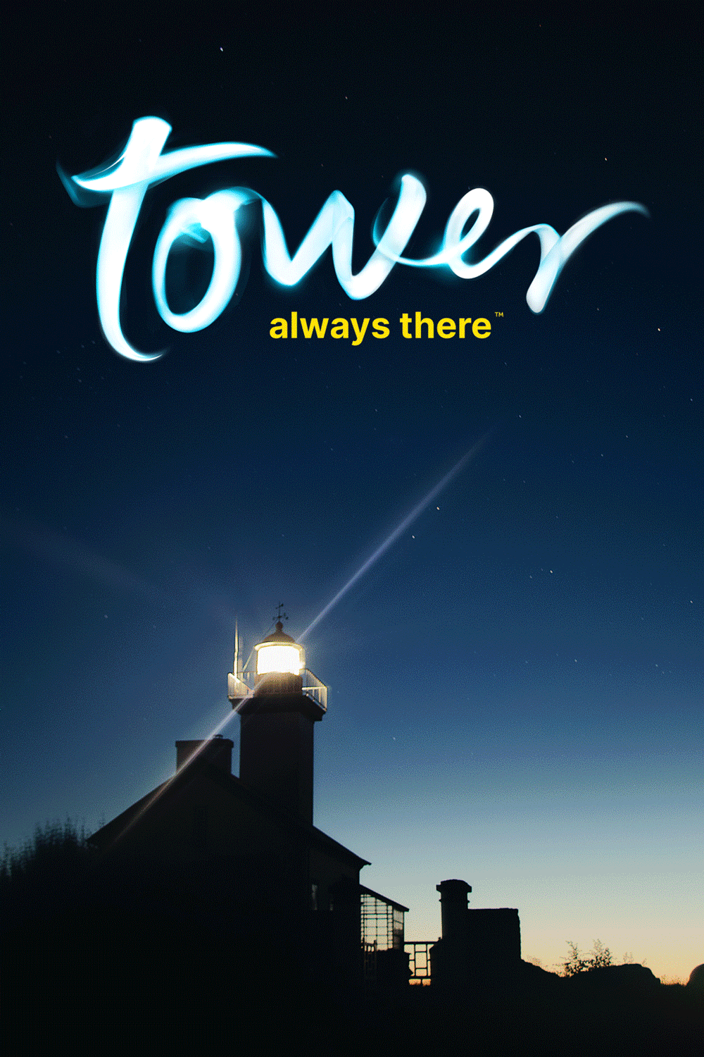
TOWER
“LIGHT IS EVERYWHERE” LOGO
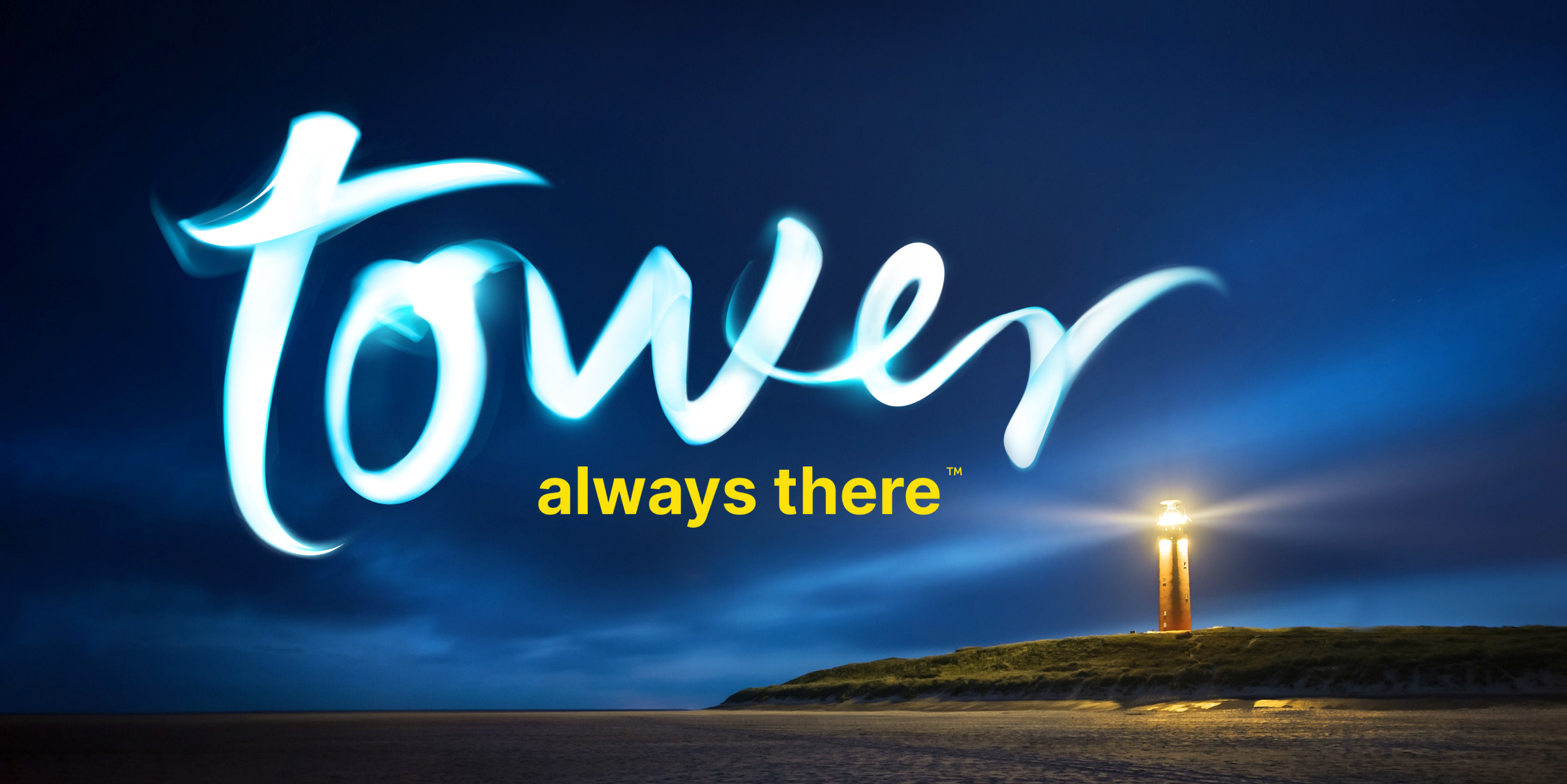
TOWER
“LIGHT IS EVERYWHERE” LOGO
“LIGHT IS EVERYWHERE” LOGO
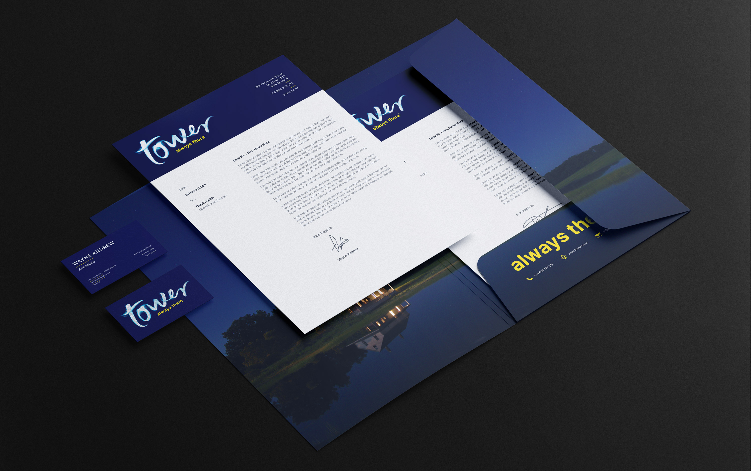
We were commissioned to develop the revamp of the Tower logo. The company had used numerous renditions of a lighthouse symbol throughout its 145 year old history, but wished to appeal to younger generations of customers. Keeping the concept of light at the heart of their brand, we created this type-led rework of the logomark made from light painting. The result is bold through simplicity - a typographic treatment that is dynamic, engaging, up-lifting & contemporary.