SHELTER
LOGO, TYPEFACE & GRAPHIC DEVICE
SHELTER
LOGO, TYPEFACE & GRAPHIC DEVICE
LOGO, TYPEFACE & GRAPHIC DEVICE
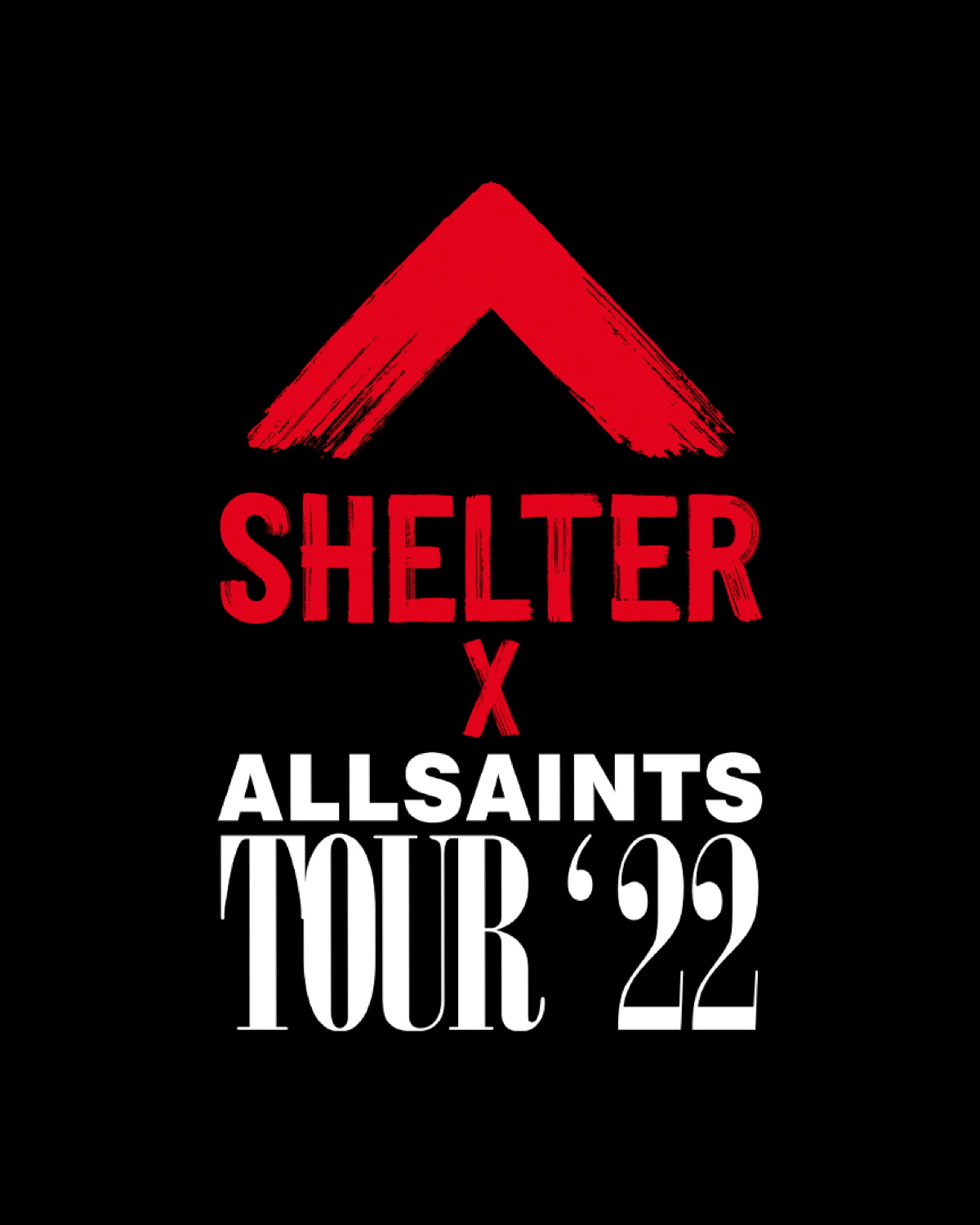
As part of this Shelter rebrand led by Superunion, we were commissioned to create a font, a collection of graphics & the roof logo mark, for a charity fighting for housing rights and preventing homelessness. The red painted stroke treatment was designed as an urgent symbol for positive change - proud, purposeful, provocative, powerful and inspired by the language of protest. Paired with black & white visuals, it's used as strong graphic statements making interventions, highlighting issues or taking a stance. It's a representation of the charity's role in making a difference to people who need them the most.
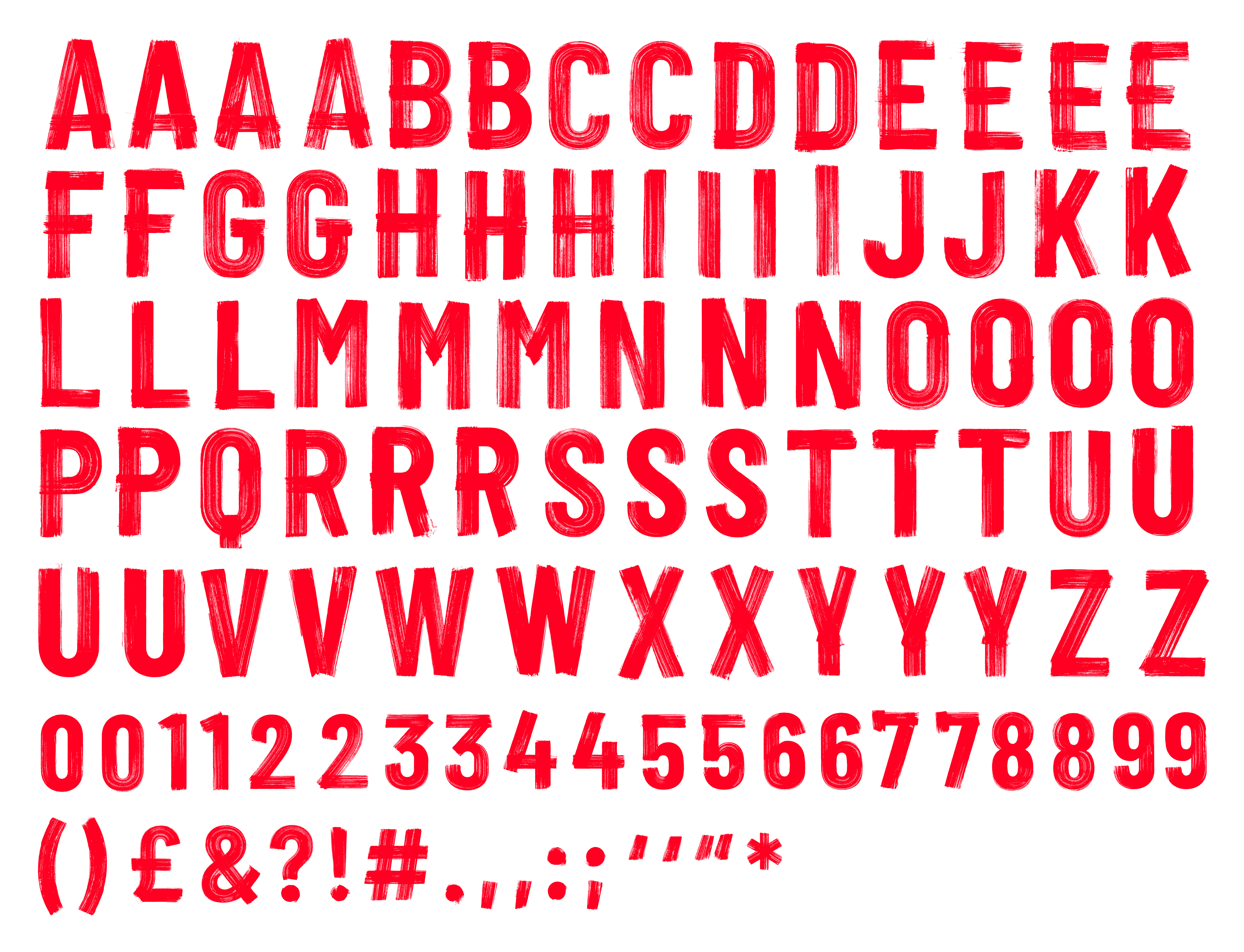
The uppercase brush font we developed is called ACTIVIST, based on Barlow Condensed. Each item was hand painted, photographed then digitised - full of beautiful and dynamic touches. The set comprises 109 characters with built-in contextual alternates in a True Type font format, with a whopping 10K vector points per, which preserved the integrity of the physical brush stroke, thus providing an incredible level of detail.
AWARDS
- Type Directors Club x Typography
- Art Directors Club, Best of Typography x Gold
- Art Directors Club, Typography x Design for Good
- Art Directors Club, Typography x Design for Good
- Communication Arts x Typography, Identity
- Communication Arts x Typography, Politics & Social Issues
- Creative Review x Typography
- Creative Review x Brand Identity
- Creative Review x In-House Campaign
- Outdoor Media Awards, Effectivenes & New Approach x Gold
- Charity Film Awards x Gold
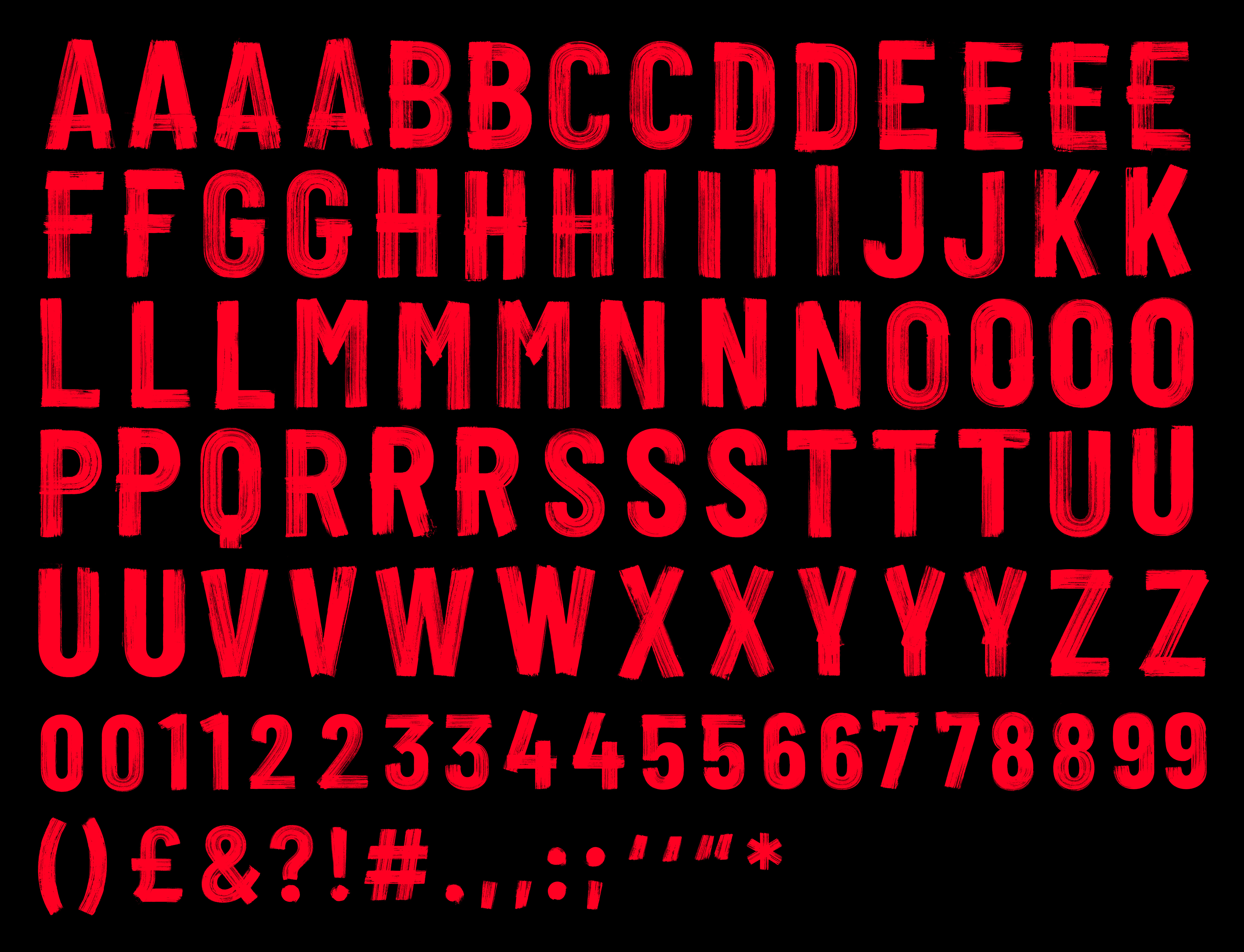