NEW YORKER
HOEFLER & FRERE-JONES
NEW YORKER
HOEFLER & FRERE-JONES
HOEFLER & FRERE-JONES
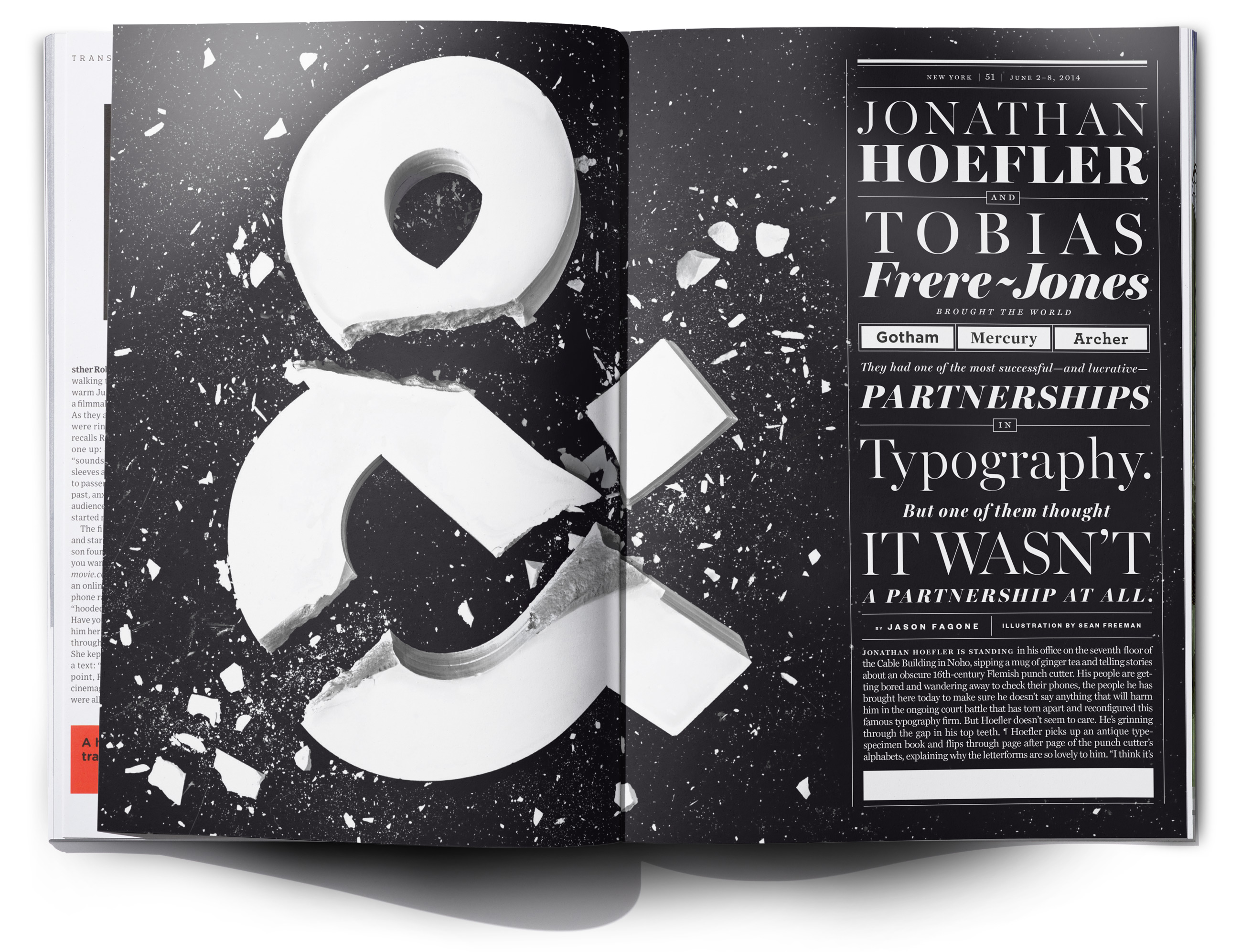
This commission was about the breakup of the type foundry Hoefler & Frere-Jones, a story that shocked the design world. They were the two world famous typographers that owned the highest value type foundry, that were now going through a nasty court battle, after Hoefler tried to cut Frere-Jones out of the picture.
The idea for the piece is to have a broken Gotham ampersand - their most prolific font that also Obama used for his campaign - still being recognizable as Gotham to represent the legal breakdown of the iconic duo. We approached both executions physically & photographically - one using mould casting & the second using textured props compositing. We created them in black on white, and vice versa to illustrate the two sides of the conflict.
The idea for the piece is to have a broken Gotham ampersand - their most prolific font that also Obama used for his campaign - still being recognizable as Gotham to represent the legal breakdown of the iconic duo. We approached both executions physically & photographically - one using mould casting & the second using textured props compositing. We created them in black on white, and vice versa to illustrate the two sides of the conflict.