CRITERION
KWAIDAN
CRITERION
KWAIDAN
KWAIDAN
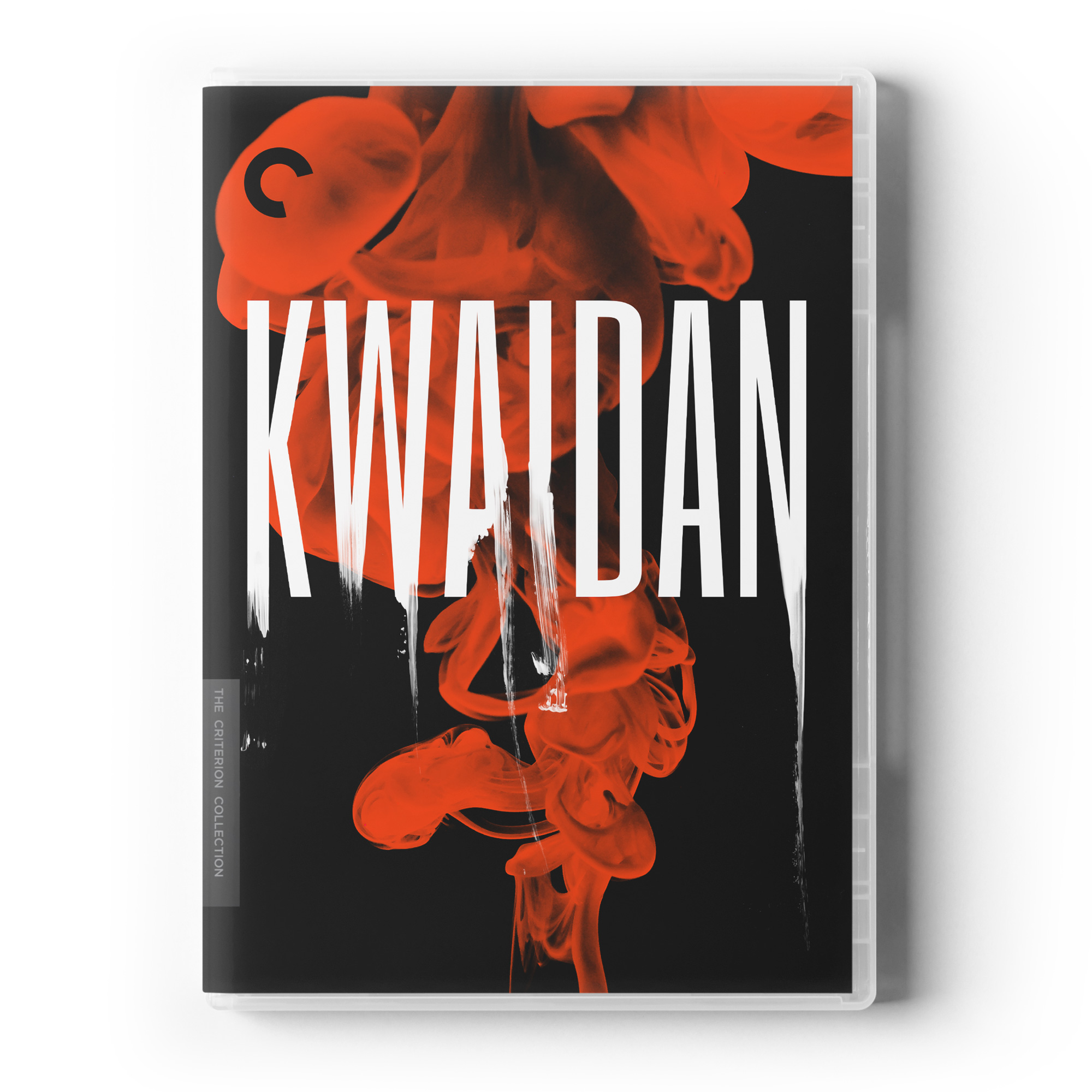
The idea behind the packaging redesign of cult movie Kwaidan (1964) was to create a beautiful artistic visual, with a deep and spooky feel. At the same time, we wanted to create an iconic image that was also rooted into the symbolic and aesthetic of the stories, as well as in Japanese culture to set the tone in a strong yet simple graphic way.
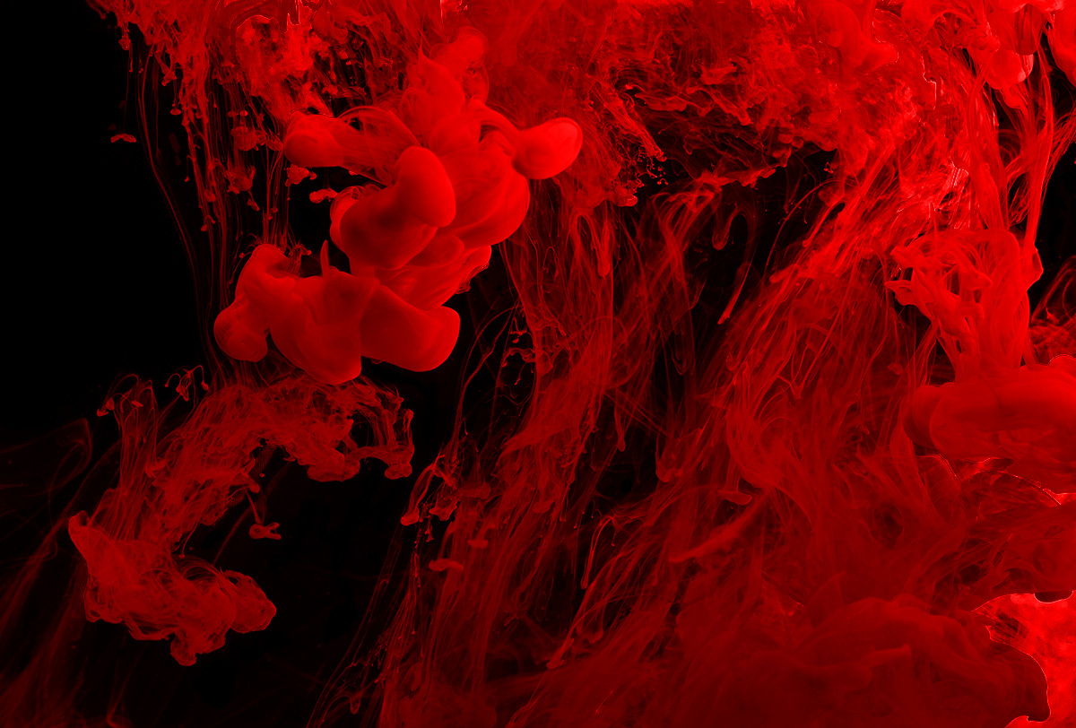
Conceptually, we immediately got inspired by the original title sequence, featuring black ink dropped in water - a physical interaction that I also always found mesmerizing and loved playing with; fluid dynamics being a big love of ours. This led us into a day of beautiful experimentations, playing with material & densities, photographing ever evolving swirly patterns with rich volutes & details to transcend the ghostly feel we were after.
On the typography side of things, we were first drawn towards a long, bold sans-serif font to enhance the letters linearity of our title, as well as making it look somehow mysterious and menacing at the same time. We then proceeded to give it a Japanese calligraphy twist with a few photographic brush strokes integrated in key spots, tying our ghost stories theme with a powerful traditional Japanese flavour.